A new way to start a meeting
Parabol
Parabol is an agile meeting platform where teams can run various types of agile meetings: Retrospectives, Sprint Poker, and Team Check-in meetings.
Shortly after I joined the team back in 2021 I worked on identifying and fixing issues with one of Parabol's most critical views, the Start Meeting screen.
The problem when starting a new meeting
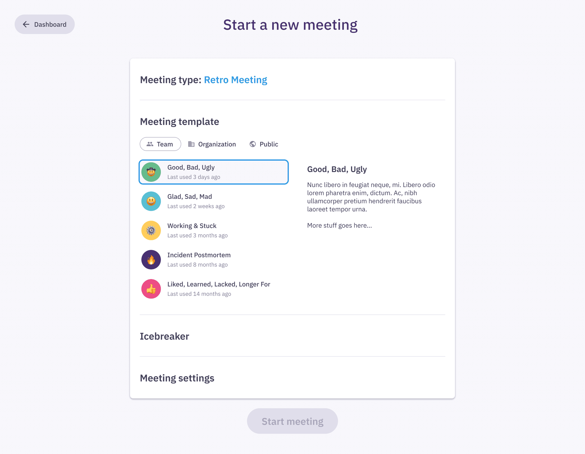
When users started a new meeting from the Parabol dashboard, they were taken to the Start new meeting screen. The goal of this screen is to let users pick a meeting type (Retrospectives, Sprint Poker, and Team Check-in), select a team, browse and select a template, and toggle the Icebreaker phase to start the meeting with.

Parabol's Start New Meeting view, before the redesign.
Analyzing feedback and usage metrics
We had at this point been identifying via our support channels repeating frictions our users were having when interacting with this screen, mainly that:
Sometimes users would start a meeting on the wrong team
Sometimes users would start the wrong meeting type
Sometimes users weren’t aware of other meeting types besides Retrospectives
These frictions would also be reflected on our usage metrics, which showed that not a lot of teams were running other meetings besides Retrospectives, and likewise not a lot of teams were making use of our meeting templates.
Both of the above are critical features that when used by teams, provide a lot of value and increase usage and growth metrics—when teams run more than one meeting type and/or make use of meeting templates, they are more likely to stick around.
Identifying issues
This view had several layout and hierarchy issues that were causing users to miss out on important features and make critical mistakes when starting a new meeting:
Because the meeting type selector was a carousel component, making most of the meeting types visually hidden, some users were not aware that they could run anything but retrospectives.
The Team, Template and Icebreaker controls take up such a small footprint in relation to the rest of the elements in the layout, making them easy to miss.
The help text for how to run a meeting is a welcoming one but only for new users. Returning users don't need to repeatedly see the instructions, especially not at the size and the level of hierarchy they have in the layout.
While the Start Meeting button is the main CTA in this view, it doesn't need to be disproportionally big and attention grabbing. This imbalance creates a situation where some users immediately click the button with out paying close attention to anything else on this view.
The Start Meeting view was not responsive and thus did not work well on mobile phones or smaller screens.


Finding a way forward
After a several rounds of iteration and feedback a solution emerged that targeted my main goals described above, and improved aspects of orientation and awareness for the user.

The dialogue pattern that sits on top of the dashboard provided some benefits over navigating to a new screen. The space constraint made us prioritize critical content and hierarchy, and it also benefited orientation by keeping the user in the same place.
The help text for each meeting type was removed and instead we used an information icon (i) on each meeting type card that when tapped takes the user to our help center, where they will find more extensive and detailed guides on how to run the meeting.
We eliminated issues around selecting the wrong team by raising the hierarchy of the team selector and introducing team members avatars to make the selection more obvious.
In addition, and despite the apparent reduced surface area, we were able to introduce a much-requested feature for changing a meeting's name before it starts.
On the other hand, meeting templates still got their separate view, one that would slide in from the right when the user tapped on that option.

Mobile
As part of these explorations we considered smaller screens and designed a solution that also worked well on phones and tablets.

Outcomes
After its release the new design was well received by our customers and it proved successful. We had a 100% reduction in incoming support requests related to the issues described above.
Tangentially the rest of the design team began to use the new patterns introduced and pieces of the design language to inform future design work and projects.
✌️